Lessons from Designing a Data Collection System in India that WORKS
Everything from optimising the UX to using intuitive data visualisations for an audience that does not want to use it.
If you haven’t got the time, just skip to the end.
A major part of my job as a “data-based researcher” is to design data collection systems for the projects my organisation works on. For the better part of the last year we’ve been working on a project aimed at facilitating an improved performance of supportive supervisors in the education department of one of the states in India. In this post I am going to use this project as a reference point to illustrate the lessons I learnt about designing a data collection and visualisation system that works. There are two parts to this puzzle –
- Creating a hiccup-free user experience that is inviting
- Presenting the result data using intuitive data visualisations
How the requirements differed in this project
Usually surveys in the development sector are conducted by a small team of surveyors who make use of a limited number of devices to collect the data. Assigning unique IDs to up to 20 devices is somewhat manageable, but when over 500 unique users fill in the data, this strategy is no longer viable and you need to make certain compromises and ensure that the system still works.
In addition, the people who recorded the data were the ones who were going to view the resulting visualisations as it was supposed to help them in planning and execution of their supervisory role.
To set a reference before we begin, I used the following services through the course of this project -
- KoBoToolbox: An open source Open Data Kit-based data collection service
- Python: The scientist’s beloved programming language
- R: The data scientist’s beloved programming language
- A bunch of other FOSS tools like ggplot2, xlsx2csv, Unicode converter etc.
- Stack Overflow, R Studio Community, mailing lists and the usual suspects
- GitHub Pages
Now let’s get to it. Grab your pen and paper.

I. Understanding your user
The user is a regular person – not someone trained in data collection or someone well-versed with technology, with an age range of 30 to 60 years.
The user’s likely first instinct is to not use your tool at all. They will complain at the first minimal hiccup and refuse to use it. Why? Because to you, the researcher, this data collection process might be an exciting prospect but to them, the field observers, it is a chore. And it isn’t like data collection systems don’t work in this country. They do. But they are often forced upon the observers. That is not what we want here. We want to create a system that is easy to use and holds a sense of purpose in the eyes of the user.
The user experience is priority!
They have a very wide variety of smartphones. With manufacturers ranging from Xiaomi-Redmi and Oppo-Vivo to Samsung and Apple, the price range goes from ₹3000 to ₹80,000.
You are likely testing your setup with a high-speed 4G LTE internet connection, or worse, a 50 MB dedicated fibernet. Thanks to impressive proliferation of high-speed internet connectivity by telecom operators in the last couple of years, the users too have access to 4G LTE but either their connection quality is spotty or their low-end mobile device uses poorer quality mobile antennae and thus cannot provide the actual high speed experience. Most of the times, it’s both. I did not foresee this and thus set up a single form for all the locations that the project was deployed in. I noticed that the file size of the XLS file (that the form was created in) was a few hundred Kb and when deployed it took a few seconds on my device(s) to load. But on the end-users devices, it just wouldn’t load. Lesson learnt. I immediately created separate forms for each location.
They do not want to download apps. Poor internet, low storage space, general phobia of “adding an unknown object to the house (the phone)” – blame whatever you like. They don’t want to do it.
They have limited memory (mental capacity) left for this task given the innumerable tasks they have to accomplish in a day. They will not remember multiple links or instructions, not because they don’t want to but out of pure mental fatigue. Keep it simple.
They are likely first time Internet and computer users. They do not know how URLs work. They probably do not know what a browser is. They do know how to “open things in Google” though.
These considerations, and more, act as a frame of reference when designing various elements of the system.
II. Making the form annoyance-free
The data collection form is going to be first and perhaps only interface between you, the researcher/designer, and the user. You’ve got to make your impression count.
The users don’t want to fill in text fields. And this is true for any user regardless of demographic because text fields are exhausting. In this particular use case, the user (as defined above) will make all sorts of errors owing not just to typos but also variations introduced due to transliteration – you’re working in India after all!
Radio buttons are the way to go. Tap on this, tap on that, and you briskly move ahead. But there’s a limit to that as well. Too many taps and you’ll induce a tapping stress on your user. Therefore…
Collect only what is necessary.
To populate the options on the form you have to source and compile a list of all the fixed assets (mostly names of people and places). This serves two purposes – one, the form is far easier to fill and remains error free; two, the user gets a sense of pride and comfort in looking at his/her name in the list. The latter might sound pithy but it is in fact a massive realisation emerging from having worked with the governmental setup in India.
Caution: When sourcing the list of assets it is best to provide a guideline with a format in which the required data be filled (in Excel preferably). I did not have the foresight to do this and ended up spending a lot of man-hours converting text to Unicode and writing single-use snippets of Python code to extract the data and put it into a structure that would work with my data analysis system.
II.A. What should the form look like?
Minimum distraction, maximum efficiency.
Someone who is constantly immersed in technology and the Internet (read: you) has a very different perception of how data collection forms are supposed to look like. The user, as described above, might struggle with things that you might find intuitive.
How many questions should you ask on a single page?
Just enough.
Create sections in the form by using categories. Each category gets a page to itself as it gives the observer a sense of accomplishment each time they click Next. A category should have 3 inputs on average, capped at 5. If there’s less than 3 questions in a category, try to re-categorize those questions on other pages. This is a rule of thumb to be used at your own discretion.
People tend to be scared of technology. Don’t scare them, support them, comfort them.
II.B. How do they access these forms?
Minimal hassle.
This was a lesson learnt from my first ever data collection expedition. I created bit.ly links for all the forms using a clever naming scheme:
bit.ly/[Project Name][Form Name]
Pretty neat, huh? Nope. The people I was working with (the users described above) had never consciously typed a URL in their phone’s browser before. They added spaces, missed the capitalisation, replaced periods with commas, and whatnot. It was a mess.
This time I dealt with this differently. I had many more forms than I did the last time (about 30 in total). There was no way I could keep track of them all. If I created a unique bit.ly link for each, I would be stuck with having to use the same form (at the back-end on KoBo) throughout the course of the project as the short URL would not change since I do not have a premium subscription to Bitly.
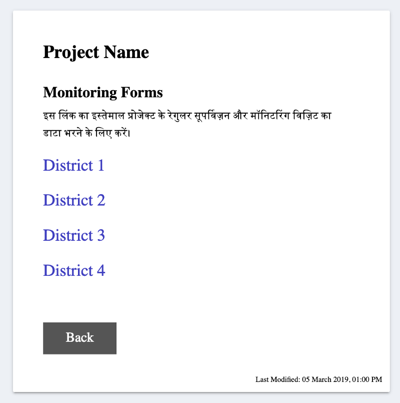
Enter, a standalone, quick to load, bare-bones webpage hosted for free on GitHub Pages –

I put all the forms in a categorised manner on this webpage. Made sure that there was no unnecessary fluff in the code and the links were easy to tap (since nearly 100% of the data was going to be entered from a mobile device). Then I created a simple bit.ly link for this webpage. In fact I made two –
bit.ly/PROJECTNAME
bit.ly/projectname
Both links led to the same page. Now even if a user accidentally typed the URL in all caps, the page would still load, thanks to the fact that modern browsers disregard capitalisation in the domain name. (BIT.LY would be read as bit.ly)
Pretty neat? Yep, definitely.
II.C. What if there are questions?
Be available.
Once the system is in place you should be available for any troubleshooting. In most cases you’ll just have to reiterate the age-old IT tip: have you tried to turn it off and on again? For the user it is not so much about getting a technical glitch resolved as it is about having a human person to talk to as they wade their way through uncharted territory. I received calls from users merely to let me know that they have submitted the data and I should check whether it has reached me yet or not – how sweet is that!
III. Talking to the Data
Here again, as before, nothing short of perfect will make the cut. Remember, the objective here is not to simply serve the purpose of the project but to establish an understanding and eventually a desire for seeking data-based approach to educational interventions.
Your users are likely first time data interpreters. They are familiar with line graphs, bar plots and pie charts – and that’s about it. No area graphs, bubble charts and radar charts.
They have very minimal, if any, experience in statistical analysis. They understand percentages and averages but likely not much more. Yes, it is more “proper” to talk of standard deviations, error bars and p-values. But all that is of no use to the end user.
If your analysis is so rigorous that it doesn’t make sense, it is pointless.
This is the classic debate in education – when you teach a topic do you stay true to the needs of the subject or the needs of the learner? If you’re wondering, it is almost always beneficial to go with the latter.
In the first part of the project, I made use of stacked bar graphs to represent the data because they could pack a lot of information into a single chart. It served its purpose. Since I was analyzing performance data, I set a color scheme for the four levels of performance that I did not alter throughout the course of the project. This got the users familiar with the color scheme and dismantled one part of their inhibition when looking at data charts.

However, it was brought to my notice that stacked bar graphs have a serious flaw – the components do not all have a common baseline. Akin to a pie chart, this makes it much harder to compare across the segments. (Read this Smashing Magazine article for a well-rounded perspective on stacked bar graphs.)
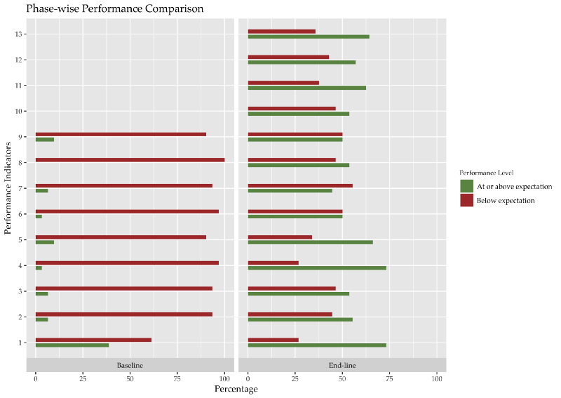
To mitigate this, in the latter half of the project, the comparison of performance over time was displayed by grouping the data together (A and B; C and D). I replaced the stacked bars with regular bar graphs since I only had two bars now and comparing them across parameters could be done more intuitively.

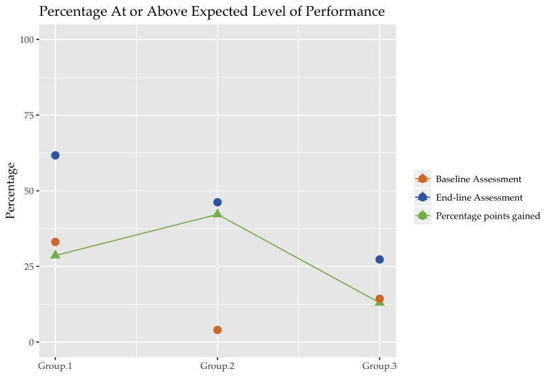
In addition, for representing gross averages I used simple line graphics to show the rise or fall of performance over different timestamps.

The purpose of displaying these representations here is not to make a claim that this is the ideal representation. The ideal is governed by the context and the use-case. The purpose here is to provide an example representation that is not only easy to understand but also makes setting targets for the future a simpler task.
Miscellaneous (Technical) Advice
People will do things to your form that you will have never imagined. Quote me on this.
— Me.
Data doubling.
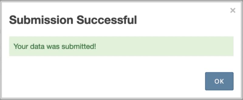
There are multiple instances of the same observation record (for the same person, by the same person). This could be termed an open-and-shut case by blaming it on the software. However, I have a hunch (based on actual user feedback) that another reason for it could be that the observers who fill in the data are not assured of the fact that their record has been submitted. Perhaps it would’ve been useful to redirect the users to another quick loading, self-hosted page that provides more feedback than the default “submission successful” popup. This page must also provide a link to go back to the form to fill in another record.

If you’re keen on using trackers on your webpage, you can record how many hits this submission page receives and match it against the number of records collected on your data collection service. This will show you whether there is a loss in the service or not.
Input sanitization.
By keeping the number of text inputs in the form to the bare minimum (only one!) I thought I had solved all issues pertaining to sanitising text input. However, in instances where the observers had to enter their name using the text field, they would often type their designation along with as well, like this – “Mahesh Kumar, HM”. That extra comma would be read as a separator (since I processed all data in CSV file format) and thus break my code. I mitigated this by using the semi-colon as a separator instead and by adding a couple of lines of code to catch such instances at the data cleaning stage.
Automate 95% only.
It is pleasingly efficient to have automated scripts handle all the tasks – from cleaning and collating to analysing and graphing. Though it makes the process near real-time, it leaves room for error, especially if it is the first instance of that particular type of data being collected. I was unaware of the variety of errors (through user input or software bugs) that could creep in and thus writing a script to catch all these edge-cases was only possible a few weeks into the data collection process. Even then I found that I would often catch new errors with a cursory scroll through the raw data that would otherwise pass undetected under the “technical radar” of the scripts. One example to highlight this – there were a bunch of instances where the observer recorded an observation of his/her own performance. Making no judgement on whether it was done out of incompetence or malice, I had to disregard these records from the final analysis.
The Gist
That’s that then. Let’s revisit the lessons –
- Understand your user: what phones they use, what their Internet access is like, how familiar are they with Internet technology; do they view the data collection process as a chore, if so, how can you tackle it
- Keep the UX annoyance-free: minimise text input, use pre-populated radio buttons, display a limited amount of information on a single page
- Make the access hassle-free: set up a landing page that displays the links to the forms and provides relevant information
- Be available for troubleshooting, it makes the process more human
- Train your users in reading graphs: use simple bar and line graphics, keep a consistent color scheme, adapt to user feedback
- Do not automate each step of the process, or just keep glancing through the raw data to catch unforeseen errors
I created a Sample Form where I employed most of the ideas I shared above, and some that I did not share at all. The original form that I extracted this sample out of had Hindi text only, I added English translations for wider outreach through this blog post. KoBoToolbox now offers translations.
If you found this useful or have suggestions to make, please let me know through the comments. If you have questions about the programming aspect of the job or require template code for the graphs above, again, just leave me a comment.